Aruba, Dutch Caribbean. Planet Earth.

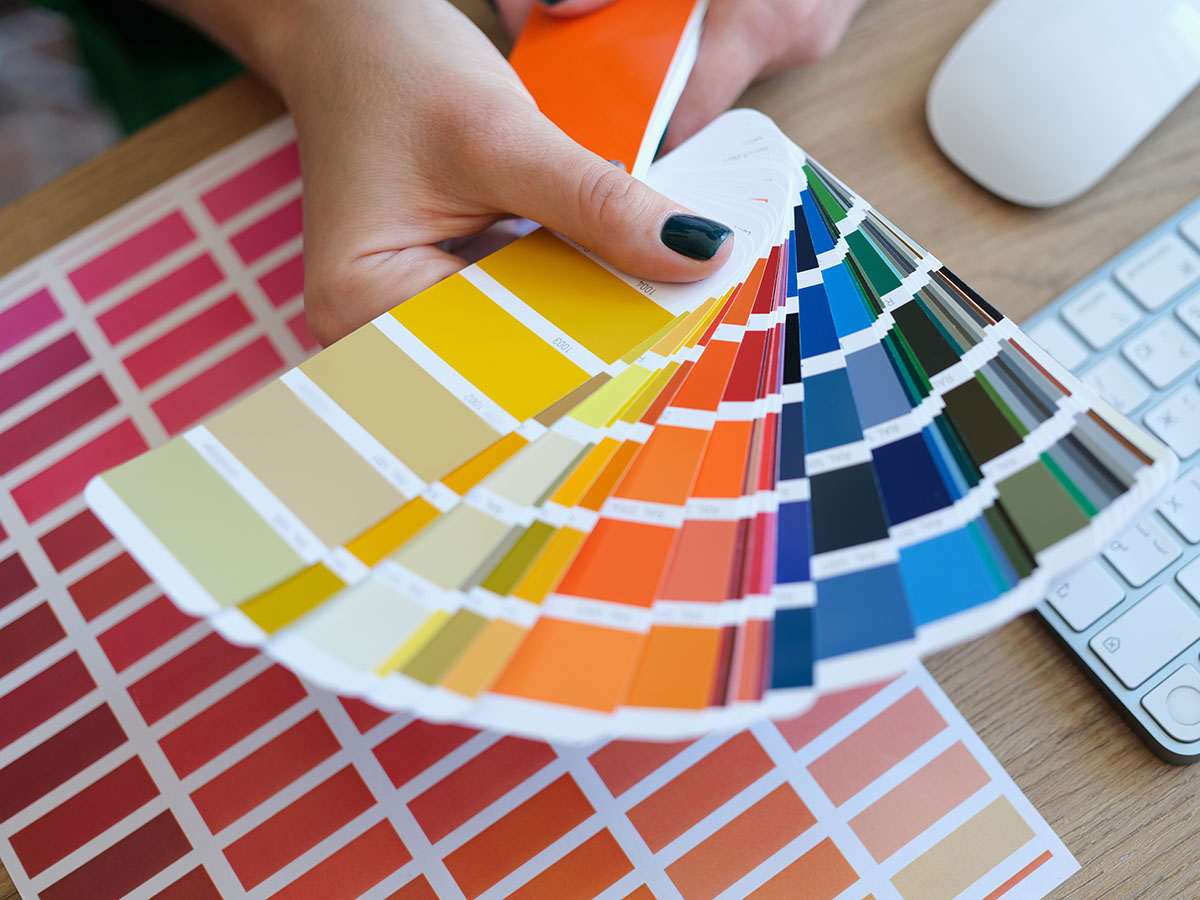
Adobe’s 2026 creative trends forecast, released by Adobe Express and Adobe’s business blog, names four forces shaping design this year. None of them are really about software. All of them are about what audiences are tired of.
Adobe Express’s companion list of top graphic design trends for 2026 translates those four forces into things you can actually put on a page: oversized playful lettering, hand-rendered textures, collage layouts and warm, human-centered color. The through-line in both reports is the same. Technology is amplifying creative judgment here, not replacing it, and audiences can tell the difference between a brand that feels real and one that only looks it.
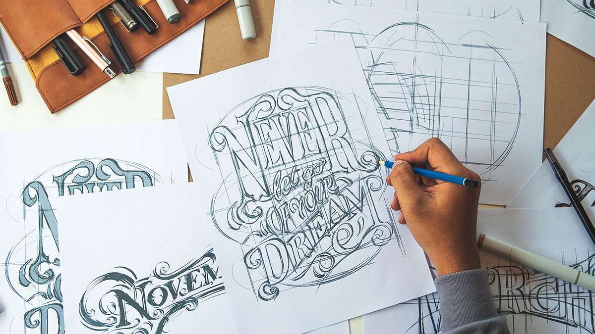
A study cited in Adobe’s report found that 82% of consumers now expect a brand to engage as many of their senses as possible, even through a screen. That sounds abstract until you put it next to a logo. A flat, single-color mark with no texture, weight or warmth reads like a form letter. This trend rewards grain, paper texture, embossed type and tactile photography, anything that suggests a hand was involved.
For a small brand, that is good news rather than a threat. Polished-and-generic favors whoever has the biggest production budget. Textured-and-specific favors whoever has the most honest story to tell, which is usually the small business, not the franchise. If it has been a while since your visual identity was refreshed, this is also a good moment to check which logo file formats you actually have on hand before a rebrand conversation starts.
Adobe’s second trend has a made-up name and a simple idea underneath it: content built from real, shared human moments beats content built from brand messaging. Seventy percent of purchase decisions are emotional rather than rational, and a stock photo of a model laughing at a salad reads as exactly what it is.
The practical version of this for a small business is candid photography over posed photography. A real customer picking up a real order. A real staff member mid-task, not mid-smile-at-camera. It costs less to produce than a studio shoot and it performs better, because it is the one thing a stock library cannot fake: specificity.
Adobe’s third trend, part of the same 2026 creative trends report, leans hardest on generative AI: absurd, dreamlike, deliberately illogical imagery built to interrupt scroll fatigue, particularly with younger audiences tired of over-produced marketing. It is a legitimate trend, and also the one most likely to go wrong for a small brand without a design team checking the output.
Used well, a little surreal humor in one social post or one seasonal campaign can make a small brand feel current. Used as the whole identity, it can make a serious business look like it does not take itself seriously. The safer version: keep your logo, your color palette and your tone of voice fixed, and let the surreal moments live in short-lived content, not in anything permanent.
The fourth trend, Local Flavor, needs the least translation for a business here. Adobe describes it as celebrating regional authenticity over universal, one-size-fits-everywhere messaging, told through local creators rather than a distant agency’s idea of a place.
Aruba’s small size and multilingual market, with English, Spanish, Dutch and Papiamento all in daily use, is exactly the kind of specificity this trend rewards. A menu photographed in your own kitchen, a logo that nods to a real local reference rather than a generic palm tree, copy written in the language your actual customer uses at the counter. None of that scales the way a template does, and that is precisely the point. A design that could belong to any business anywhere is now the least memorable option on the page, not the safest one.
None of these four trends require a rebrand. They ask for a shift in what gets chosen and photographed, not a new logo.
The report itself makes the point better than any summary can: technology is amplifying creativity here, not replacing it. For a small brand on Aruba, that is an invitation, not a budget line.
An online web design studio based in Aruba, building beautiful and user friendly websites that help your business connect with customers.
★★★★★ 4.8 from 16 Google reviews