The logo file formats every business owner should have

Posted September 5th, 2026 under Branding

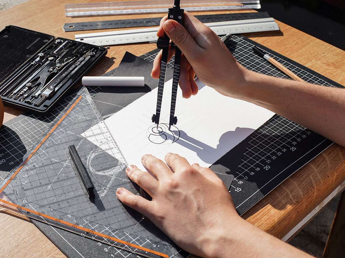
Designer working out a logo on paper with a compass, the starting point for the logo file formats a business needs

Ask ten business owners for their logo and nine will send a PNG pulled straight off their own website. It works right up until it does not — the sign shop needs vector, the embroiderer needs one colour, Google needs a square. Lucidpress, surveying more than 200 organisations, found that consistent branding can lift revenue by as much as 33%. Most of the inconsistency it measured starts with the logo file formats a business was never given in the first place.

Your logo is not one file, it is a small set of them

A logo is a drawing, and every machine that reproduces it speaks a different language. A vinyl cutter wants paths. A browser wants markup. An embroidery machine derives its stitches from clean outlines. A printing press wants CMYK. The logo file formats you own decide which of those machines you can actually serve. Hand all of them the same 800-pixel PNG you once found in an email and your brand turns up slightly wrong everywhere, and that drift is not free. The same Lucidpress research found that 81% of companies still deal with off-brand content — most of it produced by people who simply used the only file they had.

The complete set is roughly eight files. Own them once and you never have this conversation again.

Embroidery machine operator threading colour spools in a workshop

What each of the core logo file formats is for

Two families matter, and everything else follows from the split. Vector files describe shapes with mathematics, so they scale from a business card to the side of a building without ever softening. Raster files are a fixed grid of pixels, so they fall apart the moment you push them past the size they were saved at.

  • AI or EPS — the master. The editable original your designer actually worked in. You may never open it, but whoever redraws or extends your brand in five years will need it. Keep it even if nothing on your computer opens it.
  • SVG — the web vector. A text-based format that renders at any size without loss of quality, and it is now in use on 67.6% of all websites. This is what belongs in your site header: sharp on every screen, and a fraction of the weight of an image file.
  • PDF — the one you email. Vector on the inside, openable by anybody, and the file every printer, sign shop and magazine will ask you for. If you are sending a supplier one file, send this one.
  • PNG — transparency for screens. No background, so it sits cleanly on any colour. Keep one at least 2000 pixels wide and let people scale down from it, never up.
  • JPG — the fallback. No transparency, which means a white or coloured box behind your logo forever. Useful only where a platform refuses to accept anything better.
  • A favicon square. The tiny mark in the browser tab, usually a 512-pixel PNG or an ICO. It needs a simplified mark, because a full wordmark turns to mush at 32 pixels.

Colour versions matter as much as the format

Getting the logo file formats right is half the job. The other half is holding each one in the variants that real life keeps demanding, because a logo that only exists in one colour on one background will eventually be pasted somewhere it does not work.
  • Full colour, for light and for dark backgrounds. Two separate files. The version that reads beautifully on white often disappears on a dark header or a black tote bag.
  • Solid black and solid white. One-colour versions with no gradients and no thin details. This is what an embroiderer, an engraver or a single-colour stamp will use.
  • Horizontal and stacked lockups. A wide logo squeezed into a square profile photo becomes unreadable. A stacked version fixes it in one move.
  • The mark on its own. Your symbol without the words, for app icons, social avatars and anywhere the name is already right next to it.
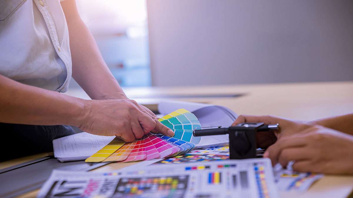
Hands holding a colour swatch fan over a printed proof sheet in a print shop

Where businesses in Aruba get caught out

On a small island the same logo has to survive an unusual range of surfaces quickly: a van door, a printed menu, a shopfront, a sponsor banner and a Google listing, often produced by four different suppliers in the same month. Several of those suppliers are off-island, which means everything is handled by email — and email is exactly where a good logo quietly becomes a screenshot.

The Google Business Profile trap catches almost everyone. Google accepts JPG or PNG only, with a recommended size of 720 by 720 pixels and a minimum of 250 by 250. Your beautiful SVG is useless there, so a square PNG has to exist before you need it. That listing is increasingly the first impression a visitor gets, the same reason consistent business data matters so much in AI search.

Language adds one more layer. Our clients serve customers in English, Spanish, Dutch and Papiamento, and in a four-language market the mark often does more work than the wordmark. That is an argument for owning the symbol as a standalone file, not for redrawing your logo four times.

How to store your logo file formats and hand them over

One folder, backed up somewhere that is not a laptop. Inside it, one subfolder per format family and file names a stranger can read: 139-logo-full-colour-light.svg beats logo-final-FINAL-v3.svg every time. Send suppliers a link to the folder rather than an attachment, and keep the PDF at the top level so the least technical person on the other end finds it first. The PDF is the right answer for a logo, incidentally, and the wrong one for a restaurant menu — different job, different file.

One more thing worth insisting on at handover: written permission to use the files, with the master AI or EPS included. A logo you cannot legally edit is one you will pay to redraw.

Your checklist for this week

  • Open your logo folder and list the logo file formats actually in it. If everything is a PNG or a JPG, you do not have a logo package, you have pictures of one.
  • Ask your designer for the vector master. AI or EPS, plus a PDF. One email, and it settles the question permanently.
  • Make the two one-colour versions. Solid black and solid white, saved as both SVG and PNG.
  • Export a 720 by 720 PNG for Google. Then upload it, and check your profile photo is not a stretched rectangle.
  • Rename everything in plain language. Five minutes now, and every future supplier picks the right file without asking you.

Talk to 139 Design Studio about a logo file audit — vector masters, one-colour versions, a web-ready SVG and the square PNG Google insists on, delivered as one organised package you can hand to any supplier.

Sources: Lucidpress — The State of Brand Consistency study · W3Techs — Usage statistics of SVG for websites · Google — Business Profile photo and logo requirements