Aruba, Dutch Caribbean. Planet Earth.


A file that looks perfect on a screen can still fail on a press. Four things separate print-ready artwork from a web graphic: correct bleed, enough resolution at the final print size, the right color mode, and a file format the printer’s equipment can run without guessing. Skip any one of them and the job either gets kicked back for a correction, or it prints with a visible defect: a white sliver at the trim edge, fuzzy text, a color that shifted from what was on screen.

Bleed is the extra artwork built past the edge of the final trimmed size, and it exists because trimming a stack of paper is never perfectly precise.
Screens display at roughly 72 DPI. Print needs at least 300 DPI, measured at the size the piece will actually be printed, not the size it happens to be on your screen. A 1000 x 1000 pixel photo prints crisp at 3.33 inches square and 300 DPI, but stretch that same file to fill an 8.5 x 11 inch flyer and it drops to around 90 DPI, which reads as visibly soft or pixelated once it’s on paper. Bumping the DPI number in Photoshop afterward doesn’t fix this; upsampling doesn’t add real detail, it just repeats pixels. The actual fix is to go back to a higher-resolution original, or better, to rebuild the artwork as a vector file in the first place, since a logo built in Illustrator scales to any size with no resolution ceiling at all.
Screens build color with light, using red, green and blue. Printers build color with ink, using cyan, magenta, yellow and black. An RGB file sent to a printer gets auto-converted to CMYK on their end, and the shift is not always predictable: bright blues can drift toward purple, and neon or saturated colors often go dull, since CMYK simply can’t reproduce some of what RGB can display. Converting to CMYK yourself before you send the file, rather than leaving the printer to guess, is the single easiest way to see the actual colors ahead of time. One detail worth knowing: a pure black built as K:100 alone tends to print washed out and slightly grey on anything larger than body text; a richer black built as C:60 M:40 Y:40 K:100 reads as a true, deep black. For a logo color that has to match exactly every time, a Pantone spot color costs more per job but removes the guesswork entirely.
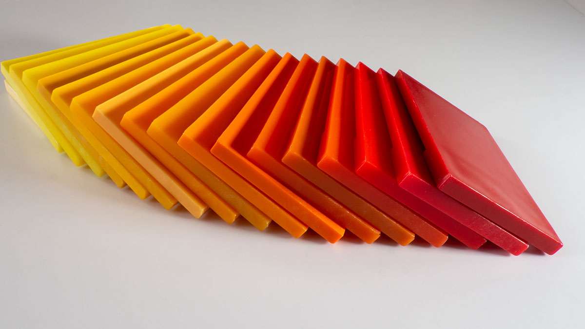
Format matters almost as much as the artwork itself.
Most small Aruba businesses don’t have an in-house designer checking files before they go to a printer, local or off-island. A logo gets pulled from a website export, a social media kit, or a WhatsApp forward, and it’s almost always web-resolution RGB, which is exactly the failure mode above. The risk compounds when materials exist in more than one language: a flyer in English, Spanish, Dutch and Papiamento often gets rebuilt separately for each version instead of produced from one print-ready master file with the text swapped out, which multiplies the chances that one version slips through without bleed or at the wrong resolution. Keeping a single vector master of your logo and key brand artwork, built once at full print quality, is the cheapest insurance against reprint costs and missed deadlines. If you’re sourcing a commercial printer while traveling, our print trade show calendar covers where to see the latest presses and materials in person.
An online web design studio based in Aruba, building beautiful and user friendly websites that help your business connect with customers.
★★★★★ 4.8 from 16 Google reviews