Aruba, Dutch Caribbean. Planet Earth.

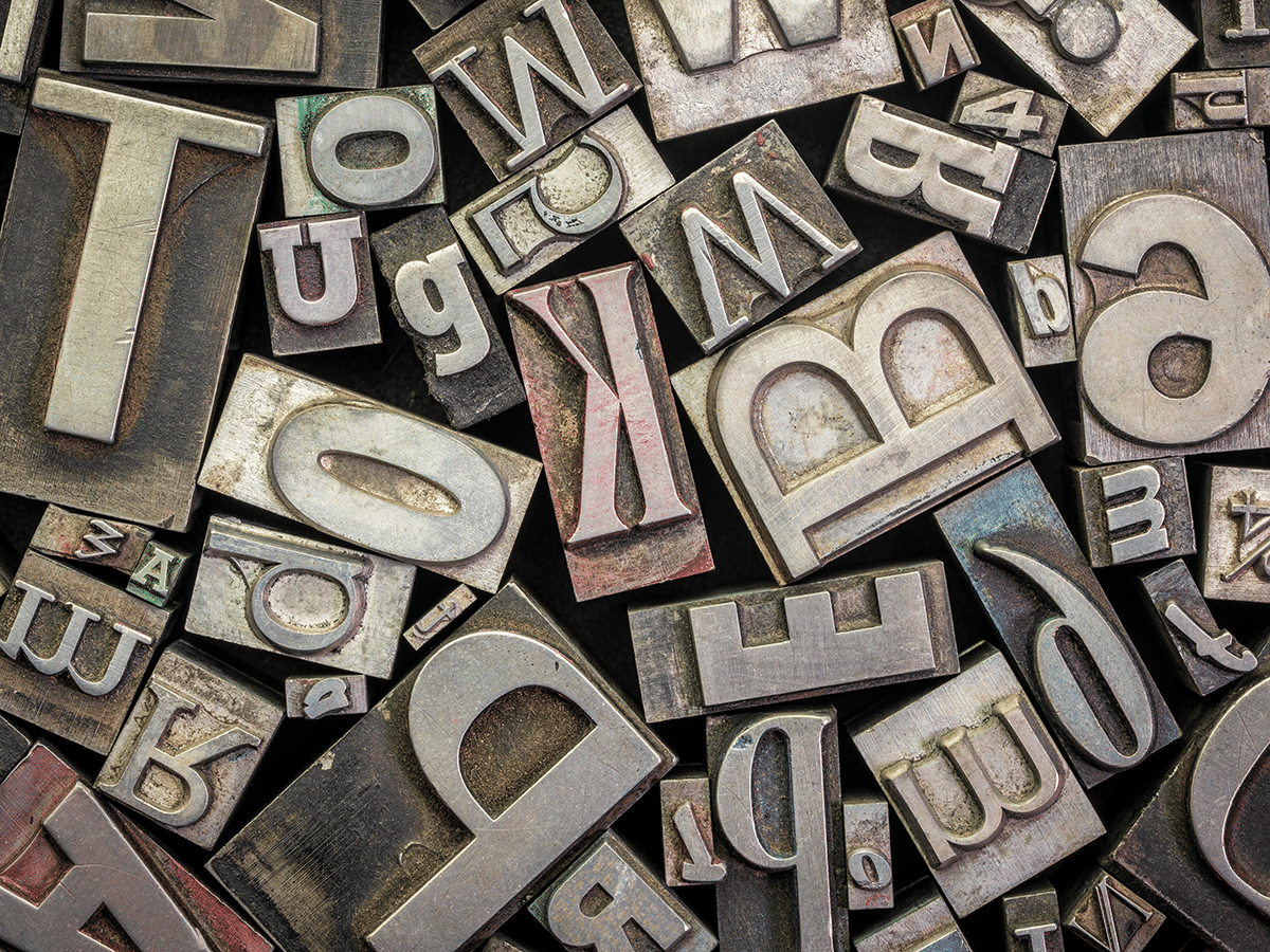
The rule design books keep repeating is contrast, and it holds up in practice. Pick one font for headings and a different one for body copy, and make the difference real — serif against sans-serif, a heavy weight against a light one, a geometric shape against a humanist one. Two fonts that are almost the same read as a mistake rather than a choice; a visitor’s eye catches the mismatch even when they cannot say what is wrong. The safer failure is picking fonts too close to each other, not too far apart.
All three below are free, hosted on Google Fonts, and load in every major browser with no plugin required. None needs more than two weights per family to cover a full site.

Two, and occasionally three. A heading font, a body font, and — if the brand genuinely needs it — one accent font used sparingly for a badge or a pull quote. Every font past that adds visual noise the reader has to sort through, and a file the browser has to fetch before it can safely paint text on screen. A good font pairing is a decision made in advance, not something assembled live in the page builder one widget at a time.
Every extra font family is a separate file the browser has to download before headings and body text can render in their intended look. Testing by KeyCDN found a page set in a system font like Arial loaded roughly 195 milliseconds faster than the identical page set in Open Sans pulled from Google Fonts — before a second family is even added to the mix. That number compounds: two font families at two weights each can mean four separate downloads standing between a visitor and readable text. On mobile data that shows up directly in Core Web Vitals — see our plain-language guide to fixing them — and in a visitor’s patience before they have read your first sentence. Self-hosting the font files, limiting each family to two weights, and setting font-display: swap so text appears in a fallback font while the real one loads all keep a font pairing from turning into a loading-speed problem.
Aruba’s own websites carry more language than most templates assume. English, Spanish, Dutch and Papiamento are all in daily use, and a visitor’s browser can move between them in the same session. That makes font pairing slightly harder here than most guides admit: a heading font has to render Spanish and Papiamento accents cleanly — á, é, í, ó, ú, ñ — and Dutch diaeresis marks like ë and ï, not just the plain alphabet most display fonts are designed around. Google Fonts lists the language subsets each font supports on its own specimen page, and it is worth checking before a heading font gets locked into a brand — especially a bold display face chosen mainly for how its capital letters look in English. A font pairing that looks sharp in English and turns into missing accents or fallback glyphs in Spanish or Papiamento undoes exactly the trust a good pairing was meant to build. For more on getting the visual details right across languages, see our post on colour and contrast rules that also sell more.
An online web design studio based in Aruba, building beautiful and user friendly websites that help your business connect with customers.
★★★★★ 4.8 from 16 Google reviews